A curated collection of articles exploring this topic in depth.
What the Canaries Caught
A single thirty-day window made the scanning look like one steady thing. Three months shows the opposite: overlapping campaigns that surge and vanish, an edge that loses its lead and then takes it back, and a curated filter already drifting out of date.
The first two posts in this series described a snapshot: one thirty-day window, read once. A snapshot shows that the traffic exists and roughly what it wants. It does not show whether any of it lasts.
The curated probe paths are the canaries: honeypot URLs that no real reader would request, so each hit is a clean signal. The security dashboard writes a small JSON file of aggregated counts every day, and the files have now been accumulating for about three months. The traffic they record has not been constant, so the extra months are worth reasoning about.
Toronto did not stay on top
Post 2 spent its length on one anomaly: a single edge, Toronto, drew more probe traffic than the next several put together, and the trail led to a cluster of Azure Canada Central machines. The conclusion there was that edge location reflects where cloud capacity sits relative to CloudFront, and says little about where an operator is.
The longer record complicates the anomaly before it confirms the reading. Toronto's share peaked near 45 percent in mid-April, fell to 11 by late May, and spent June under 20, behind Chicago and São Paulo, neither of which had been near the top in March. Then, in the week I wrote this, it climbed back to the top of the chart at around half its April share.
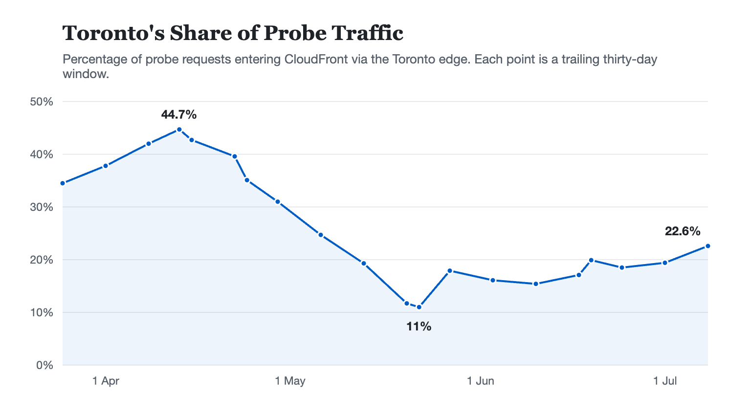
That trajectory settles the question more firmly than a clean disappearance would have. Had Toronto's dominance been a property of the site, its share would have held. Had it simply faded, a single campaign ending would explain it. The chart shows turnover instead: the lead passing to Chicago, then São Paulo, then back to Toronto at half strength, changing hands with whichever cluster of rented machines is busiest that week.
The bursts do not line up
The clearer finding came from the two detection tiers.
Weekly probe volume was never steady. Across the record it ran from about 2,300 requests in a quiet week to over 8,000 in a busy one. Swings of that size are unremarkable on their own. What caught my attention was where they fell. In one May week, novel probes made up nearly three quarters of all probe traffic. The following week the known tier spiked to its highest point in the whole record and the novel share fell back to a third.
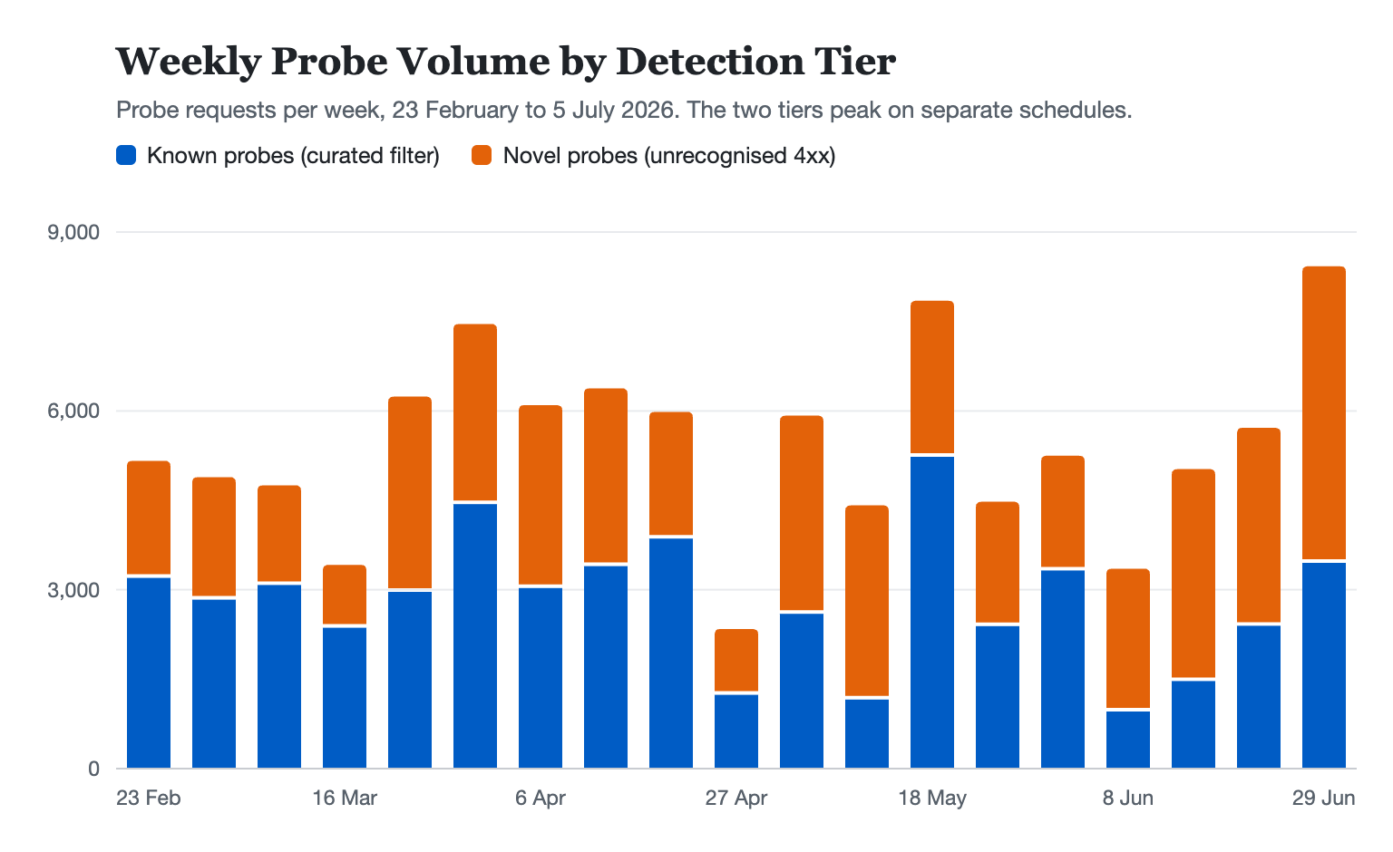
Those peaks did not coincide, and the mismatch is what needs explaining. If the traffic were one homogeneous stream of background scanning, the two tiers would be two samples of the same thing, and would rise and fall roughly together. The simpler explanation is that the curated list and the novel tier are catching separate campaigns, with separate target lists, running on their own schedules.
The individual sources show the same unevenness. One source out of Tokyo made 159 requests across 53 paths in 69 seconds and then vanished. Another, out of Toronto, spread 256 requests over two days, slow enough to stay under any reasonable alarm. The intent looks identical from the logs. The tempo, the infrastructure, and almost certainly the operator are not.
So rather than one population of scanners reading one target list, the reality is closer to many small campaigns crossing the same hostname at different times, each with its own list and its own pace.
The filter is ageing
In March, novel probes sat between 30 and 40 percent of weekly probe traffic. From mid-May, three separate weeks cleared 70 percent. I would not read a precise decay rate into that. The weekly numbers are noisy, and a single campaign can distort a month. The direction is steady enough to trust: a growing share of scanning arrives on paths the curated list does not recognise.
That is the ordinary fate of any static detection list. The list matched the traffic when I wrote it. The traffic moved on, and the list stayed where it was.
Operationally this changes little. The site returns 403 or 404 to these paths whether or not the filter recognises them, so three months of effort from an unknown number of operators has so far earned the scanners a uniform wall of error pages. The pressure the ageing filter creates is more interesting than its miss rate. Once the novel tier surfaces the busiest unrecognised paths, the obvious response is to promote them into the curated list so they are caught properly again.
Wrap up
Three months is longer than thirty days, but it is still data from one low-traffic site. The result is just a small local view whose shape happens to match what broader internet scanning studies have reported: campaigns that turn over, infrastructure that churns, and sources that often have no prior history.
For example, the network telescope view of internet-wide scanning(opens in a new tab) describes the same kind of internet-wide background motion, while GreyNoise's 2026 State of the Edge Report(opens in a new tab) found that half of exploitation attempts came from previously unseen IPs.
The longer record shows probe traffic arriving in waves, infrastructure appearing and disappearing, and a static filter slowly drifting out of date. That leaves one practical question for the final post: what to do when the watch list falls behind.